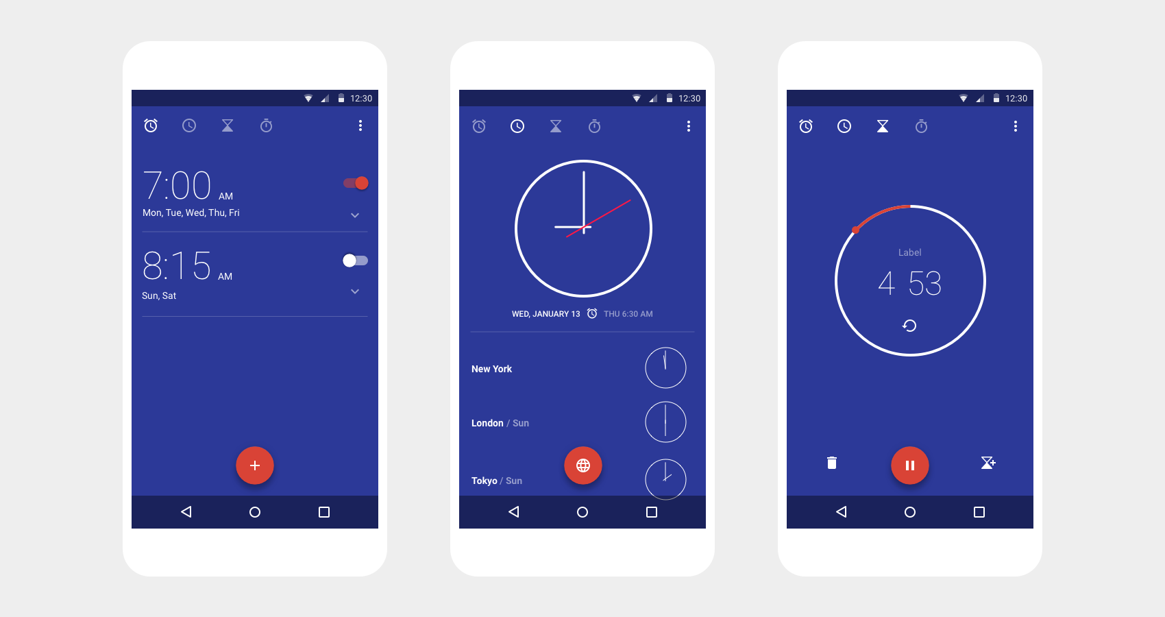
Before - Google Clock Version 4
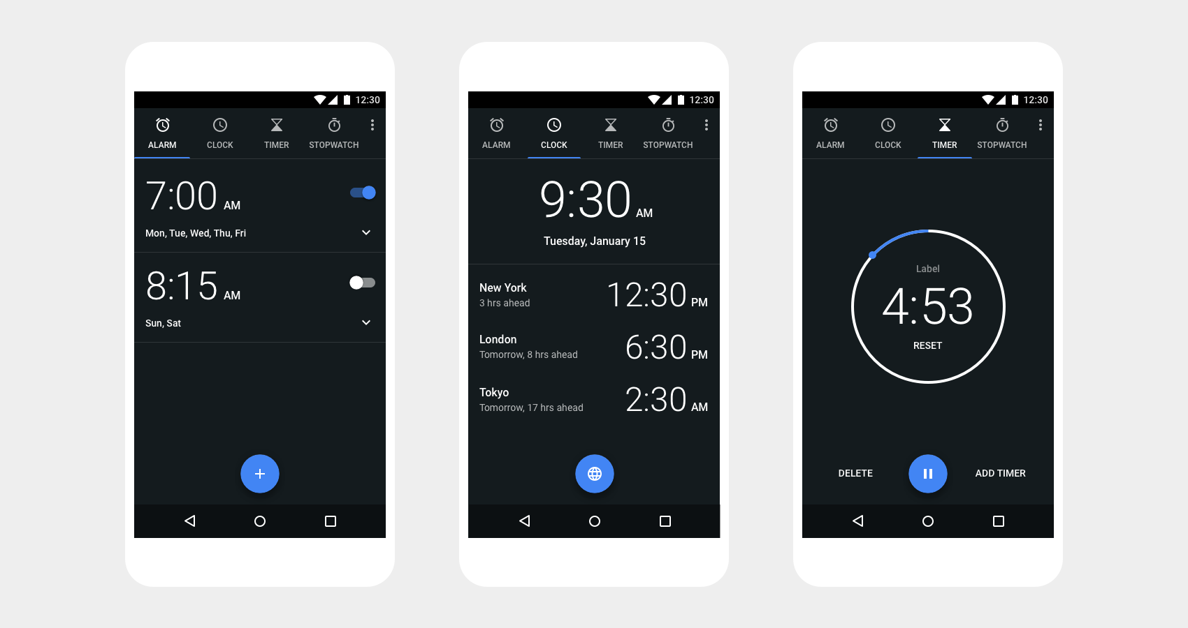
After - Google Clock Version 5
Android “Essentials” are a suite of utility apps that provide users with the everyday necessities for their phone, tablet, or wear device. These include Google Clock, Calculator, FM-Radio, and Settings. I had the pleasure of working on these apps throughout 2015 and 2016.
Clock exemplifies how Google is awesome at the essentials. As visual / motion designer on this project, I focused on making the app more intuitive, personal, and delightful. This included updating the app's navigation, typography, color, layout, and motion design, while introducing new features such as custom music alarms.
Before - Google Clock Version 4
After - Google Clock Version 5
Through research, we found that users were frequently opening the clock app when it was dark out Whether setting an alarm right before drifting off to sleep, or checking the time first thing in the morning. Therefore we chose to fully embrace a dark theme, with Google Blue as an accent color.
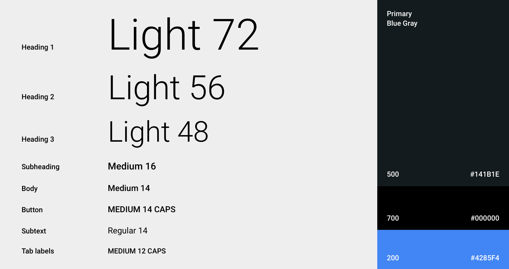
Previous iterations of the clock app has dozens of type styles. We paired this down to a limited range of contrasting styles in order to provide greater legibility and clear typographic hierarchy.
I was also resonsible for a complete motion audit of the Clock app - refining transitions and polishing microinteractions. With keen attention to detail, we used motion to communicate spacial relationships, engender trust, and evoke delight.
Alarm open / close transition
Timer start / stop transition
Calculator provides simple and advanced mathematical functions in a beautifully designed app. As UX Designer on Calculator, I designed details like history and memory, and gave the app a fresh coat of paint.