
Essentials
Android Essential Apps
As a Product Designer for Android’s suite of essential pre-installed apps, I helped shape the everyday tools that millions of users rely on across their phones, tablets, and wearables. From Google Clock, Calculator, Audio Recorder, Fit, and Keep, my goal was to turn routine interactions into moments of clarity and delight — creating a cohesive design language that made Android’s core experiences feel intuitive, human, and distinctly its own.
Clock
Google Clock
Clock exemplifies Google’s commitment to getting the essentials right. As the visual and motion designer on the project, I focused on making the experience more intuitive, personal, and delightful. My work spanned navigation, typography, color, layout, and motion design, culminating in a refreshed app that felt both familiar and thoughtfully evolved — including new features like custom music alarms.
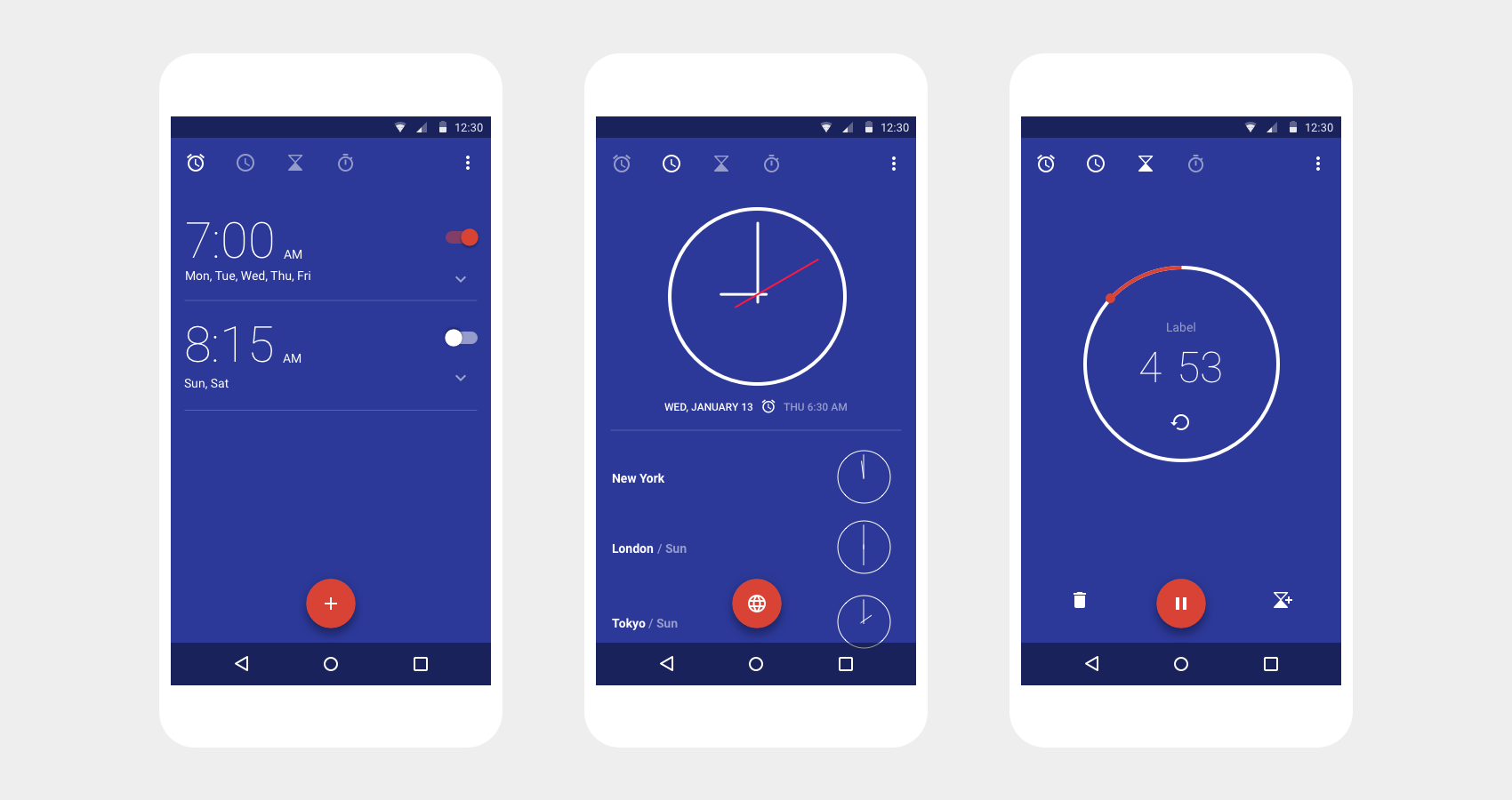
Before - Google Clock Version 4
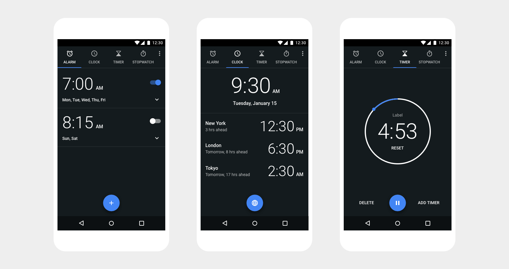
After - Google Clock Version 5
Color & Typography
Through research, we found that users were frequently opening the clock app when it was dark out.
Whether setting an alarm right before drifting off to sleep, or checking the time first thing in
the morning. Therefore we chose to fully embrace a dark theme, with Google Blue as an accent
color.
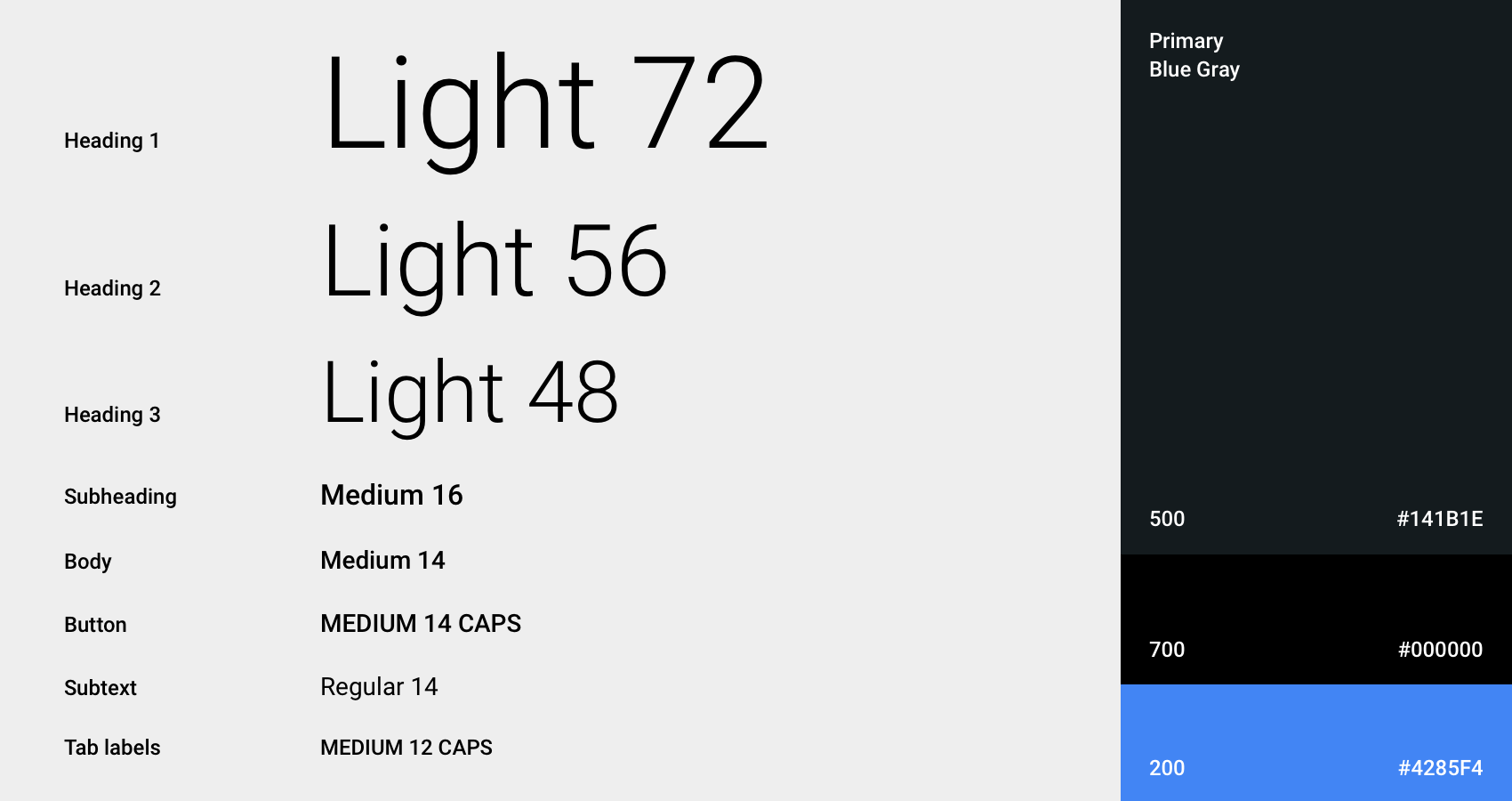
Previous iterations of the clock app has dozens of type styles. We paired this
down to a limited range of contrasting styles in order to provide greater legibility and clear
typographic hierarchy.
Motion Design
I was also resonsible for a complete motion audit of the Clock app - refining transitions and polishing microinteractions. With keen attention to detail, we used motion to communicate spacial relationships, engender trust, and evoke delight.
Alarm open / close transition
Timer start / stop transition
Calculator
Google Calculator
Calculator provides simple and advanced mathematical functions in a beautifully designed app. As UX Designer on Calculator, I designed details like history and memory, and gave the app a fresh coat of paint.
Fit
Google Fit
Google Fit is a health-tracking platform for Android. When Fit launched in 2015, I was responsible for elevating the motion design of the Android app. I focus on a few key moments in the user experience where motion could provide delight and personality, such as opening the app and achieving a goal.
Daily goal animation
Out-of-box animation
Navigation transitions
Keep
Google Keep
Keep allows users to quickly create, access and curate notes, lists and photos. However as collections of notes grow in number, organizing them in a meaningful way isn't always easy. In the fall of 2014 I joined the Keep team to help introduce labels and mutli-select capabilities, making it easier for users to find and organize their notes.
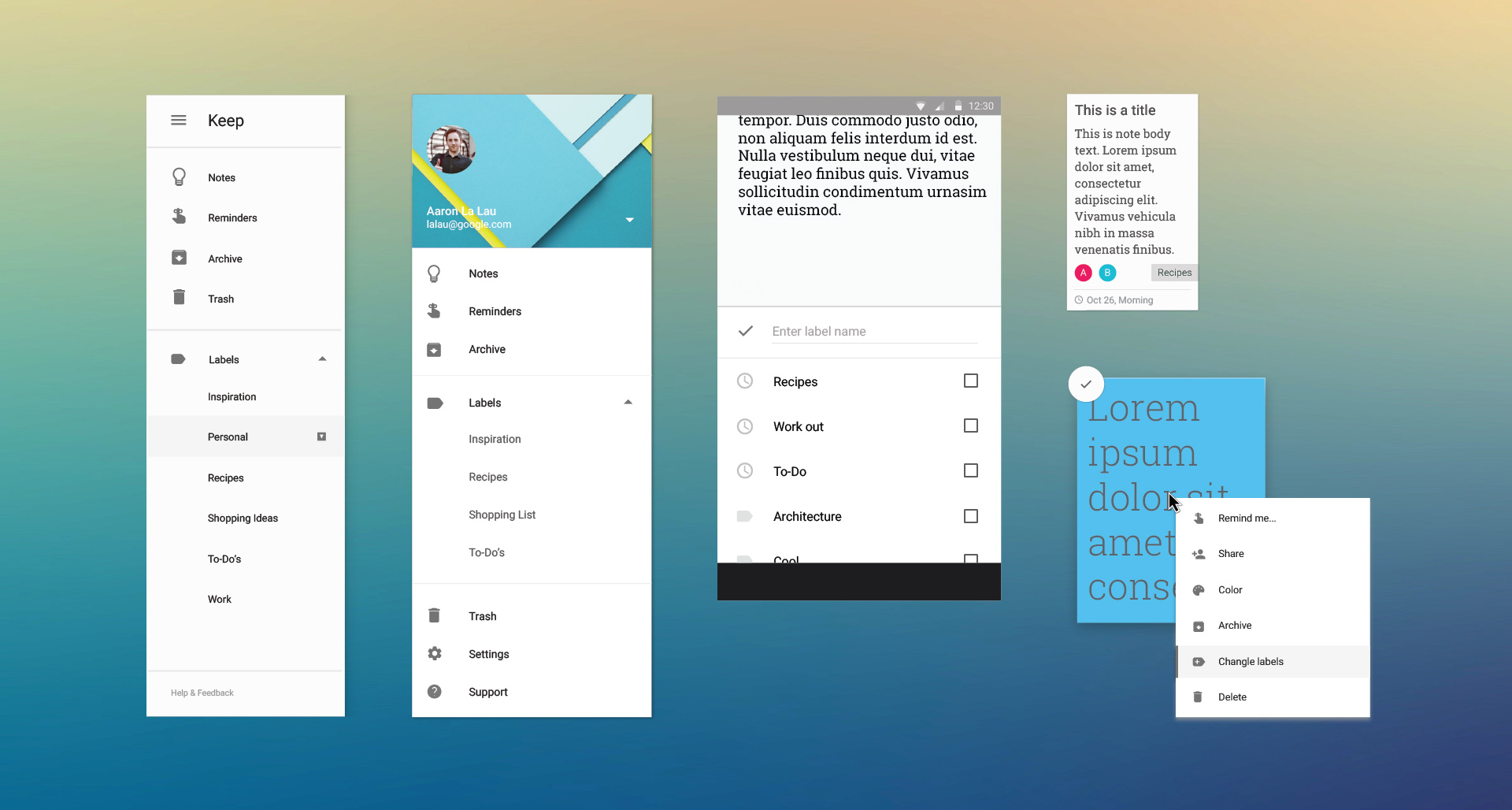
New UI / Components
Labels
Labels are a feature that helps users organize their notes by subject, such as shopping lists,
ideas, personal notes, work notes, an so on. Users can add multiple labels to a single note,
allowing them to organize notes into multiple categories.
Along the way, I explored a
number of models for organizing notes, including groups & stacks before arriving at labels.
I also explored various interactions (some more viable than others) for managing labels.
Drag to label concept
Drag to menu concept
Final flow
Desktop prototype of the "stacks" concept
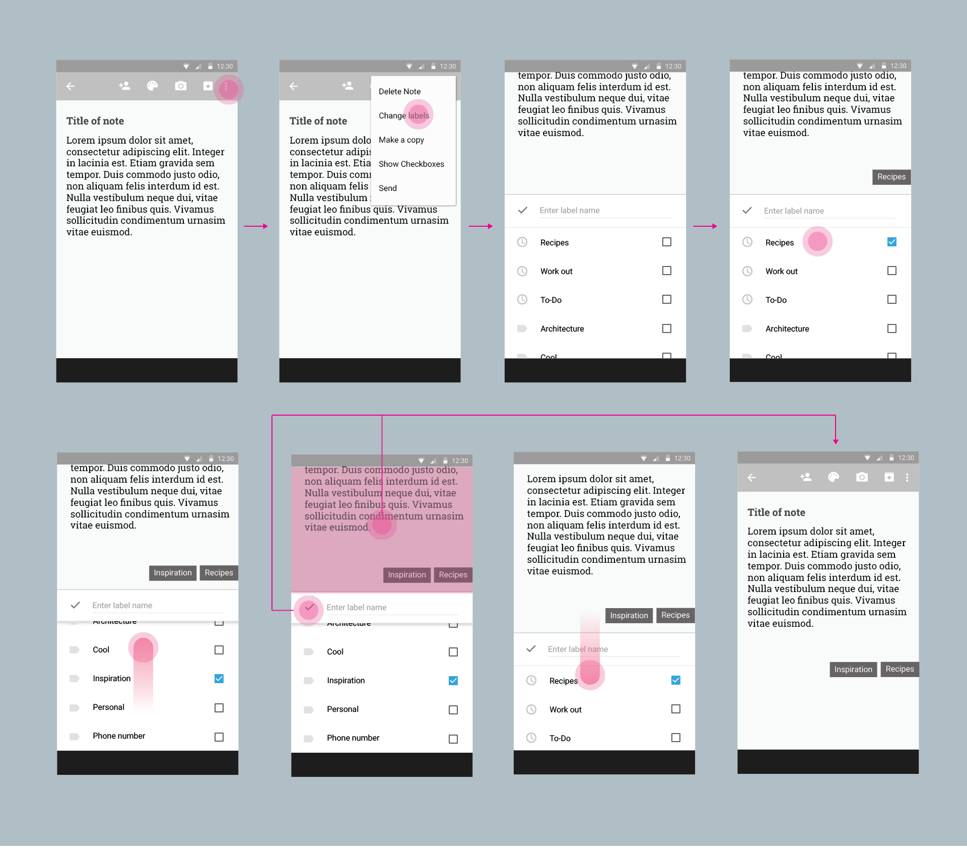
Final IxD Flows
keep.google.com
This process also lead sparked a redesign of the Keep Web experience, where I designed multiselect + drag & drop features. I created a number of interactive prototypes to help communicate to eng how this redesign could be implemented. I then collaborated with a research to conduct usability studies in order to evaluate the redesign.
