

YouTube Shorts
Brand Identity
When we announced YouTube Shorts, we not only introduced a new way to watch and create, we also unveiled a new logo. As Design Lead for YouTube Shorts, I was responsible for leading the design of this new mark. Working closely with YouTube's in-house Art Department and Marketing teams, we developed this symbol into a dynamic identity capable of scaling across diverse applications.
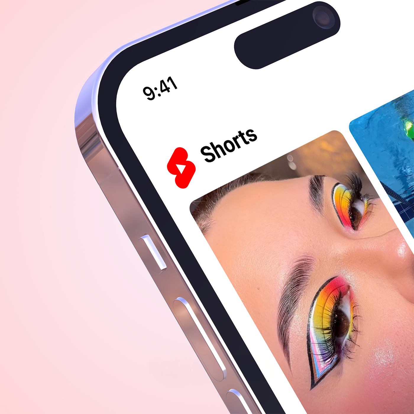
The YouTube Shorts logo's design is rooted in the foundational structure of the broader YouTube app icon family. By adhering to the same underlying grid system, we established a visual language that ensures seamless integration and brand cohesion. This structural consistency not only strengthens the immediate visual connection but also provides a scalable framework for future brand extensions.
Beyond a literal representation of an S for "Shorts," the symbol was intentionally crafted to evoke a sense of creativity, speed, energy, forward momentum, and playful innovation. It serves as a visual embodiment of the vibrant and dynamically evolving landscape of short-form video.

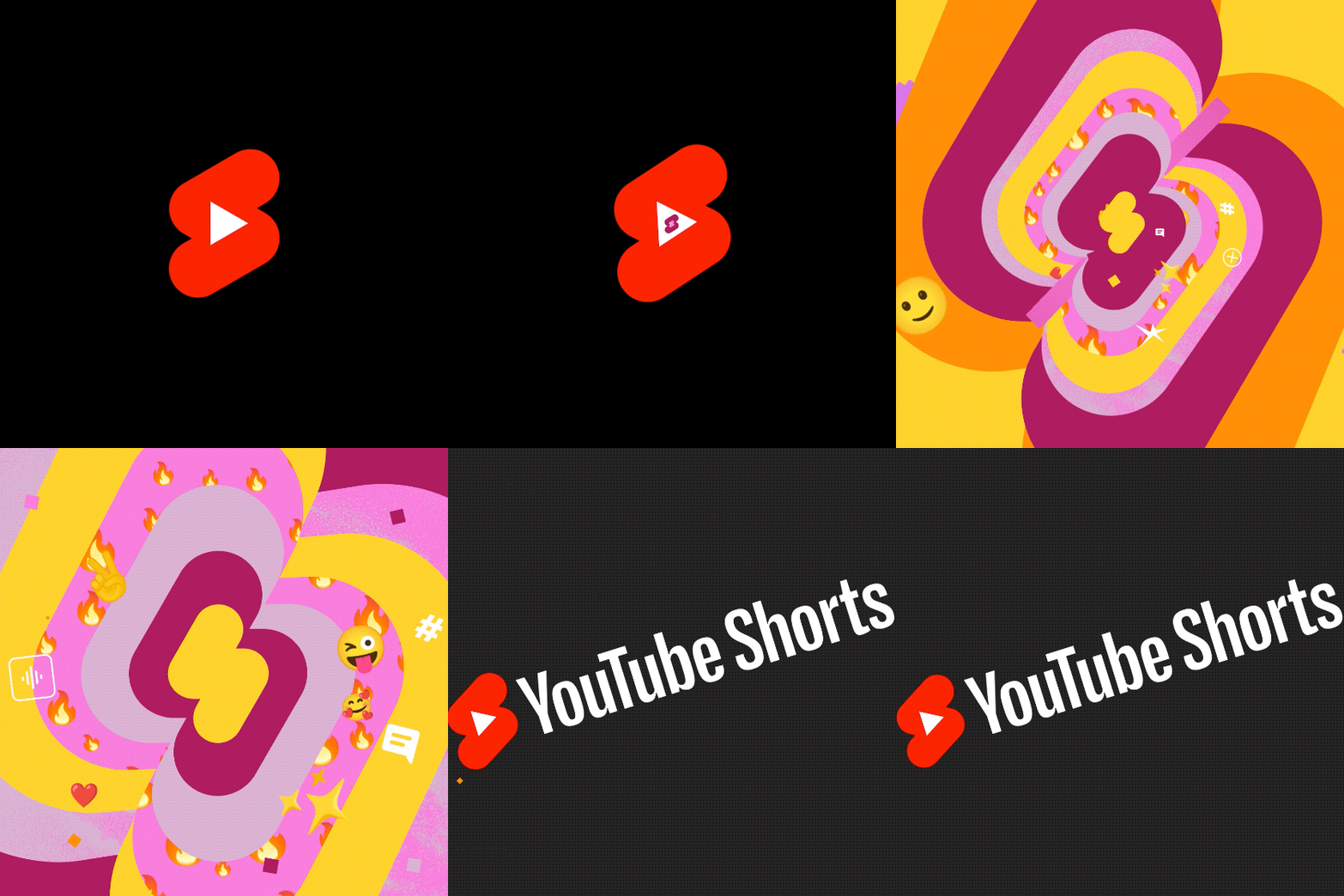
In motion, the energetic symbol really comes alive. Leveraging the vibrant YouTube color palette, these movements inject an electric energy and further amplify the logomark's inherent sense of speed and playfulness.
Dynamic identity
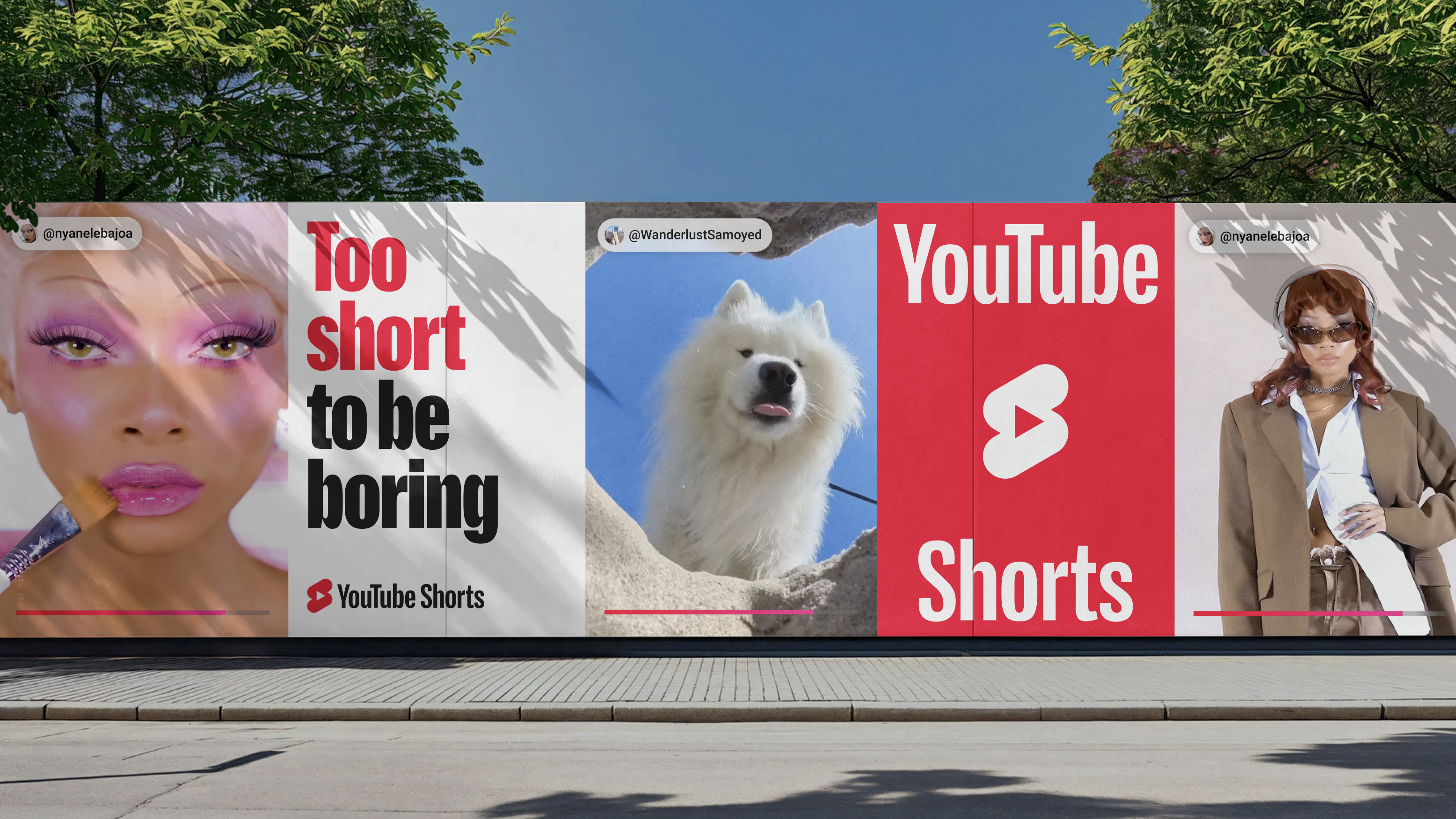
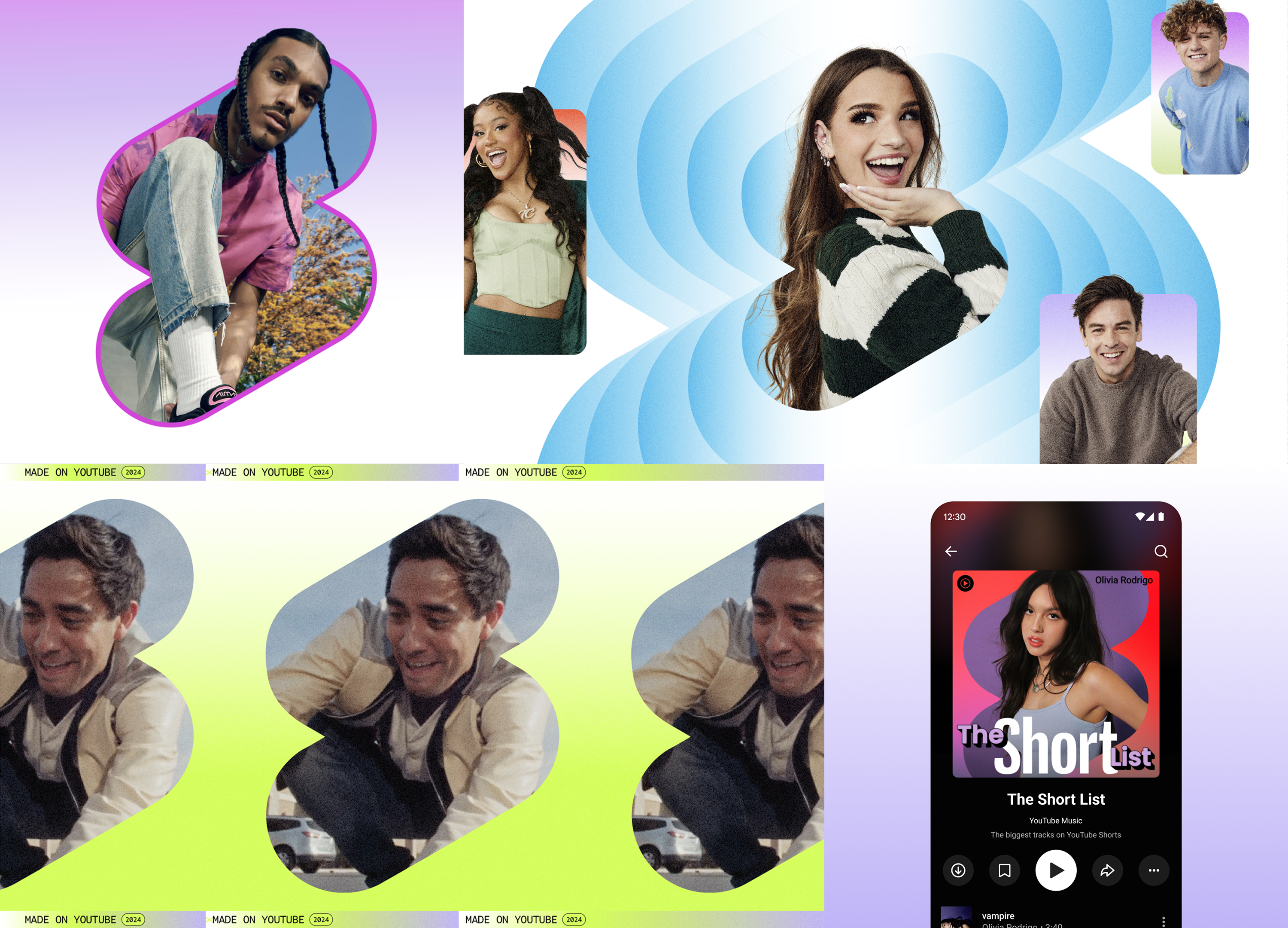
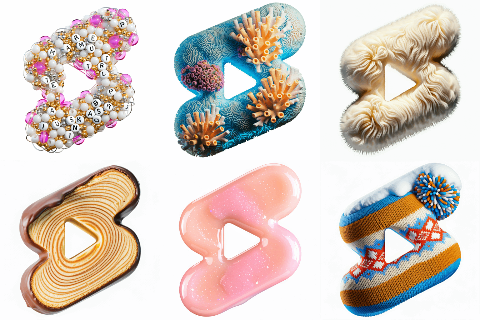
Reflecting YouTube's continuous cultural evolution, the YouTube Shorts logomark was developed as the central element of an expressive identity system. Embracing vibrancy, energy, and cultural resonance, this system allows the icon to seamlessly adapt to diverse applications, from high-impact marketing campaigns to visually engaging music playlist artwork. The logomark's capacity to morph and evolve into varied expressions provides limitless opportunities to communicate change, movement, and flexibility. This adaptable framework enables YouTube Shorts to delivering fresh and contextually appropriate brand presentations while preserving its essential, recognizable traits.
Community reception
Finally, it’s been incredible to see how the YouTube Creator Community has embraced this little
logo. We’ve seen the symbol recreated in everything from illustrations, cakes, cardboard, slime,
cement, and even a hydraulic press. Not to mention all the creative ways it is used in video
thumbnails!
What started as a quirky shape has grown to represent a vibrant part of the YouTube community.
We look forward to seeing creators continue to let their Shorts flag fly well into the future!
❤️